In *Module 2: Design Principles for Effective and Accessible Multimedia*, I had the opportunity to learn more about accessible design and to reflect and learn from the accessible design mistakes that I have made in the past. By using the WAVE accessibility checker tool, I was able to learn about the accessibility weaknesses in my WordPress blog. One of the main issues that I discovered by using the tool was the lack of high-contrast text on my site. This surprised me! When I first made my WordPress site, I made sure to choose a theme that I thought was accessible. Running the WAVE accessibility tool showed me that I need to make sure to not only use my own judgment when designing websites. I plan on using WAVE to test future web development projects of mine!
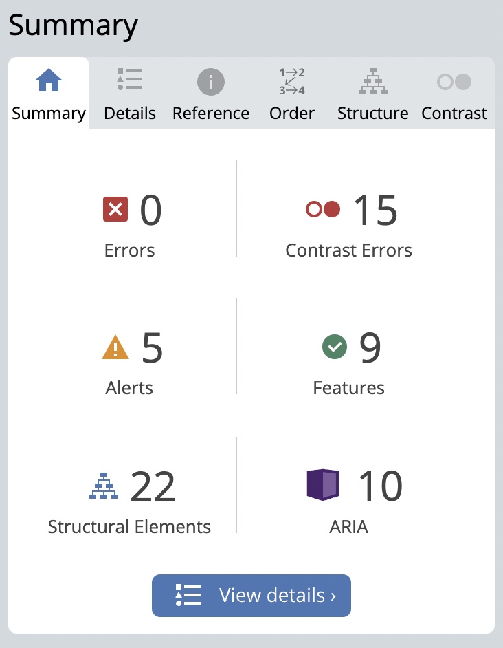
WAVE also made me realize that I did not add any alt text to the screencast that I made! In addition to forgetting to add alt text, I also forgot to add captions to my screencast. While it is possible to auto-generate captions, the results can sometimes to so-so.
I made my infographic about the five stages of language learning! I focused on simplicity while creating my infographic. I did this by using a limited colour palette, and by using simple imagery. Using a limited colour palette and simple imagery helps reduce the viewer’s cognitive load by ensuring that they do not have to concentrate on mapping colours to different ideas presented in the infographic.
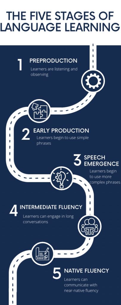
I found Canva to be very helpful while making my infographic. Being able to view many different templates allowed me to explore and come up with many different ideas for my infographic. I also found Canva’s recommended images to be very helpful. The images that Canva recommends are based on the images that have already been added to an infographic. This helps users keep their images consistent, which in turn leads to their infographic being simplistic and legible!
While graphic design is visual, I think that it is very possible to make graphic designs accessible for those with visual impairments! This can be done by adding alt text to designs and by ensuring that they can be read by a screen reader. If one is using code to create their design, they can ensure that a screen reader can read their design by using the appropriate HTML tags in their code. HTML is the programming language used to design the ‘skeleton’ of a website or design. How the website or design is styled or reacts to user interaction is determined by other programming languages that are put on top of the HTML.
To me, inclusive design is the practice of designing for real people. During my first two years of studying Computer Science, I found that it was easy to forget that the ultimate goal for the code that I was writing was for it to be able to help *real* people! I think that this happens to many students early on in their degree as most of what we focus on is getting comfortable with the algorithms and math used in Computer Science. After completing some co-ops and learning about web development, however, I realized that inclusive design should always be the main goal of anything that I create. Including design classes early on in Computer Science degrees would be incredibly beneficial.
Hi Samantha , I really liked how you made infographic!! The infographic was very organized. The process of language learning was very fascinating as well. I can totally relate to the process of language learning based on my experience. I was just wondering if the given 5 steps of language learning applies to computer languages like JavaScript because those computer languages are not verbal.